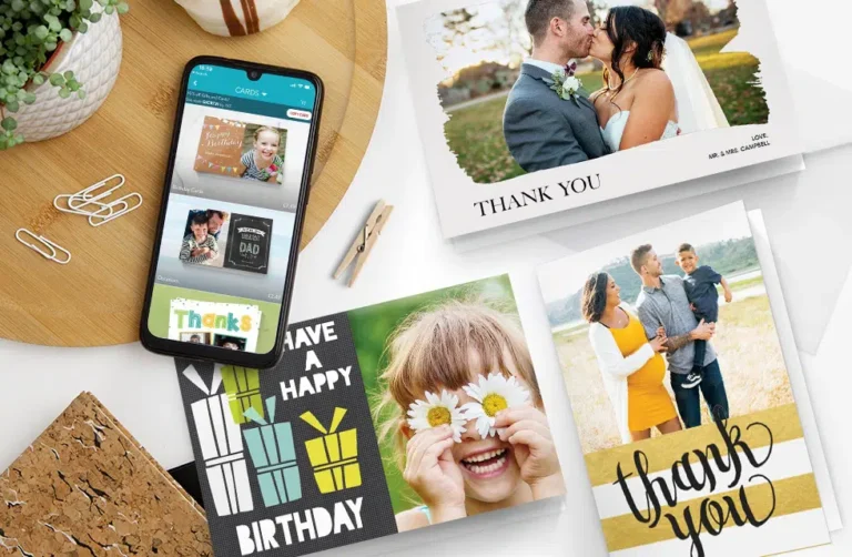
Creating a personalized card that actually looks like it came from a design studio is no longer a slow or complicated task. The concrete answer upfront: you can create a professional-looking card online in minutes by using modern template-based design tools, selecting a layout that matches your purpose, customizing it with images, fonts, and colors, and exporting it in the right format for print or digital use.
The key is not the complexity of the tool, but the structure you follow. Once you understand how to build a clean layout, choose fonts that pair well, and use templates strategically, even someone with zero design experience can produce a card that looks polished and intentional.
What makes the process simple today is how online editors automate complex design rules. You’re no longer adjusting margins manually or struggling with layers.
Instead, you refine the parts that matter emotionally: the message, the mood, and the personal elements. The outcome feels professional because the underlying structure is handled for you.
Step 1 ─ Clarify the Purpose and Mood of the Card
Before you open a card editor, you should already know two things: the purpose of the card and the emotional tone you want to convey. Professional designers begin with intention, and this makes customization far easier.
For example:
| Card Type | Tone | Features That Work Well |
| Birthday | playful, warm | bright colors, rounded fonts, confetti patterns |
| Thank-you | sincere, calm | soft colors, elegant serif fonts, subtle backgrounds |
| Wedding | refined, romantic | muted palettes, thin-line typography, floral accents |
| Graduation | proud, bold | high-contrast colors, strong typefaces, photo inclusion |
| Business | clean, modern | neutral palette, geometric layouts, subtle branding |
Once the tone is defined, the rest of the decisions feel natural instead of random.
Step 2 ─ Choose a High-Quality Template

The template you choose is essentially your card’s foundation. A well-structured template saves you hours and guarantees that the result looks intentional and aligned.
Some guidelines when choosing:
- Pick a template that already fits your tone.
- Look for templates that have a clear hierarchy and spacing.
- Prefer templates with flexible text boxes so you can rewrite messages easily.
- Choose a size that matches your final use (digital, postcard print, folded card).
Midway through your search, most creators rely on online tools that give them flexibility and speed. A popular option is Adobe Express, which includes a very intuitive card generator that allows you to choose a template and customize everything instantly. It’s online, works in any browser, and gives you professional structures from the first click.
Step 3 ─ Customize the Layout With Personal Elements
A template becomes your card only after personalization. High-quality tools let you swap every element, but the goal is not to change everything, only the parts that create emotional value.
Add Your Photos Cleanly
Upload a photo with good lighting and resolution. If the template includes a frame, let the frame guide the crop. If it has no frame, keep the image edges clean and avoid stretching.
Rewrite the Headline
Your main message should be short and memorable. A birthday headline like “Happy Birthday, Mom!” works perfectly because it’s personal and simple. Avoid long sentences. Strong cards rely on a bold, clear centerpiece.
Modify Colors
You can match the card’s palette to:
- your recipient’s favorite color
- a seasonal theme
- your brand colors (for business use)
- colors in the photo you are using
When the palette and photo align, the card immediately looks coherent.
Choose the Right Fonts
The default font pairing in the template is almost always safe. Only change fonts if you have a clear stylistic reason. Modern tools allow you to preview font combinations quickly without breaking the layout.
Step 4 ─ Refine the Design for Professional Polish
Once the card has your text and images, you need to make small adjustments that elevate it from “nice” to “professionally crafted.”
Here are elements worth checking in detail:
Alignment
Make sure:
- text lines align with each other
- icons or shapes are evenly spaced
- photos don’t sit awkwardly off-center
Even a small misalignment can create an unprofessional feel.
Spacing
A compressed card feels chaotic. Add space around the headline and space between paragraphs. Slightly widening margins creates a luxurious look.
Contrast
High contrast between text and background ensures readability. Dark text on a light background is classic and safe.
Balance of Elements
Professional cards never overload the space. If the design feels busy, remove one decorative shape or reduce font size slightly. Simplicity reads as confidence.
Step 5 ─ Final Proofreading and Message Polishing
Even if the layout is perfect, a typo can ruin the final impression. Take a moment to read your message out loud. This simple step catches mistakes your eyes may skip.
You can expand your message by including:
- a short personal note
- the date or event details
- a signature or handwritten-style font
- a small, meaningful quote
Make sure the message fits the tone. A heartfelt card should sound sincere and warm. A humorous card should feel light and casual. A business card should be concise and professional. The message drives the emotional outcome, so polish it as carefully as the visual design.
Step 6 ─ Export the Card in the Right Format

Your export format affects the quality and use of your card. Different platforms offer different output settings, but most professional editors follow similar standards:
|
Use Case |
Format |
Why |
| Printing | PDF (high resolution) | sharp text, correct sizing |
| Digital Sharing (email/social) | JPG or PNG | lightweight, universally supported |
| Messaging apps | PNG | maintains clarity and transparency if needed |
If you’re printing at home, choose a thicker matte or satin paper. If you’re sending the card to a professional printer, download the CMYK print-ready file if the editor offers it. Proper export is a large part of what separates professional results from average ones.
Step 7 ─ Test Before Sending or Printing
A quick test prevents unexpected issues. Print a low-quality draft on regular paper or preview the digital card on another device. This shows whether the colors look right, the text is readable, and the images are sharp.
Two things to check especially:
- Brightness – Printed cards tend to appear darker than on-screen.
- Margins – Some home printers cut too close to the edges.
Making quick adjustments at this stage avoids waste and disappointment.
Final Thoughts
Creating personalized cards online is fast, intuitive, and surprisingly sophisticated today. With the right template, thoughtful customization, and a few professional finishing touches, you can produce cards that look expertly designed without investing hours or learning advanced design software. The combination of modern editing tools and simple design principles makes the process accessible to anyone.